
These days, most people visit websites on their phone, so if a site doesn’t work well on mobile, visitors leave fast. But what actually makes a website “mobile-optimised”? Here are the key things to look for.
1. The Website Fits the Screen Automatically
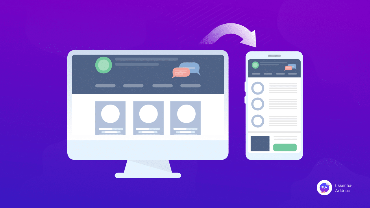
On a mobile-friendly site, the layout adjusts to any screen size: big phones, small phones, iPads, everything.
If you ever open a site on your phone and have to pinch-zoom or scroll sideways, that site is not mobile-optimised.
A good mobile site should feel like it was designed for your phone from the start.
2. Text Is Easy To Read
No squinting. No zooming.
A properly optimised site:
-
uses a readable font size on phones
-
has enough spacing between lines
-
keeps paragraphs short
If reading feels effortless, that’s a good sign the site is mobile-ready.
3. Buttons Are Big Enough to Tap
You should never struggle to tap a button or accidentally tap the wrong thing.
A mobile-friendly website uses:
-
large, finger-friendly buttons
-
clear spacing between links
-
obvious calls-to-action (like “Call Now” or “Get a Quote”)
If you don’t have to “aim like a sniper” with your finger, the site is doing it right.
4. Fast Loading Times
Mobile visitors are impatient and slower mobile networks make this more important.
A good mobile-optimised site:
-
loads in under 3 seconds
-
uses compressed images
-
avoids heavy pop-ups or huge files
Faster speed = happier visitors.
5. Simple Navigation
On phones, menus need to be easy to open and easy to understand.
Mobile-ready sites use:
-
a clean “hamburger” menu
-
short, simple menu items
-
clear page structure
If you can find what you want quickly, the navigation is doing its job.
6. Touch-Friendly Images & Galleries
Good mobile sites make images work nicely on small screens:
-
images resize automatically
-
galleries swipe left and right
-
tap-to-expand works smoothly
If photos behave like those in your phone apps, the site is well-designed.
Why Mobile Optimisation Matters
A mobile-optimised website means:
-
more visitors stay on your site
-
Google ranks it higher
-
customers are more likely to contact you
Most people browse on their phones, your website should meet them there.