
A website’s layout is more than just how things look, it determines how easily visitors can find information, understand your message, and take action. A well-structured layout keeps people engaged, improves conversions, and strengthens your brand.
Here are the best practices for website layout that every business should follow.
1. Put the Most Important Content Above the Fold
“Above the fold” means the part of the page users see before scrolling.
Visitors should immediately understand:
-
Who you are
-
What you offer
-
What problem you solve
-
The next step they should take
This is not the place for long paragraphs or clutter—keep it clear and compelling.
Tip: A strong headline + short subheading + clear CTA works best.
2. Use a Clear Visual Hierarchy
Great layouts guide the eye naturally.
Use hierarchy to show what’s most important:
-
Larger font = higher importance
-
Bolder colours = attention-grabbing
-
More spacing = visual separation
-
Buttons stand out more than links
If everything on the page has the same visual weight, visitors don’t know where to look.
3. Stick to a Consistent Grid System
A good grid layout keeps everything aligned and makes your site feel cohesive.
Grids help:
-
Structure your content
-
Ensure proper spacing
-
Improve readability
-
Make the design feel modern and clean
Most WordPress themes (including those SwiftSites uses) handle this automatically, but it’s important to keep layouts balanced and not break the grid unnecessarily.
4. Keep Navigation Simple and Predictable
Visitors should not have to guess where things are.
Good navigation:
-
Uses clear labels (“Services,” “About,” “Contact”)
-
Stays sticky at the top
-
Has no more than 5–7 main items
-
Prioritises the pages that matter most
Confusing menus lead to confusion—and confusion leads to visitors leaving.
5. Use Plenty of White Space
White space (empty space) helps your layout breathe.
It:
-
Improves readability
-
Prevents clutter
-
Makes your design feel modern and premium
-
Helps highlight key elements like CTAs
Beginners often try to fill every inch of space; professionals know space is your friend.
6. Make Buttons and CTAs Impossible to Miss
If you have a goal, sales, bookings and enquiries, your CTAs must be:
-
Clear
-
Bold
-
Repeated throughout the page
-
Easy to click on mobile
-
Action-oriented (“Book Now,” “Get a Quote”)
A beautiful website won’t help your business if users can’t find the next step.
7. Design for Mobile First
Most traffic comes from phones, so your layout should work perfectly on smaller screens.
Mobile-friendly layouts include:
-
Stacked sections
-
Large tap-friendly buttons
-
Shorter text blocks
-
Compressed images
-
Sticky navigation
-
Fast loading speed
If your site looks good on mobile, it’s easy to make it look good on desktop, not the other way around.
8. Keep Your Layout Consistent Across Pages
Consistency builds trust.
Your pages should all share:
-
The same header & footer
-
Uniform spacing
-
Consistent typography
-
Matching colours
-
Similar section styling
Visitors should feel like every page belongs to the same website.
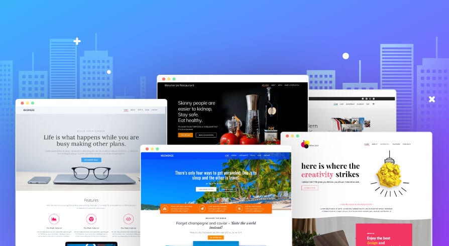
9. Use High-Quality Visuals Only
Low-quality images ruin otherwise excellent layouts.
Use:
-
High-resolution, compressed photos
-
Clean icons
-
Brand-coloured illustrations
-
Images that support the message—not replace it
If your images are outdated or pixelated, it makes the whole business look unprofessional.
10. Test, Analyse, Improve
Great layouts evolve.
Regularly test:
-
How long visitors stay
-
What they click
-
Which sections they skip
-
CTA performance
-
Mobile experience
Tools like Hotjar, Google Analytics, and A/B testing help refine your layout over time.
Final Thoughts
A well-designed website layout is simple, intuitive, and focused on guiding the user toward action. By following these best practices; clear hierarchy, strong CTAs, plenty of white space, and mobile-first design, you’ll create a site that looks professional and performs even better.
If you’d like help building a high-converting website layout, SwiftSites can design it for you, clean, modern, fast, and fully optimised.